Project Overview
SiteTuation is a SaaS platform designed to help businesses evaluate potential locations through interactive maps, analytics, and location intelligence. My focus was creating a user experience that transforms complex datasets into clear, actionable insights while maintaining an intuitive workflow.
My Role
Tools
Problem Statement
Business owners and analysts often rely on multiple disconnected tools and data sources when evaluating potential business locations. This fragmented process makes it difficult to compare sites efficiently, identify meaningful insights, and make confident, data-driven decisions.
The challenge was to design a platform that could consolidate complex location intelligence into a single, intuitive experience while keeping information clear, accessible, and actionable.
Design Process
Research & Discovery
To create an intuitive and effective dashboard experience, I researched existing SaaS platforms to understand common design patterns, dashboard structures, and user expectations.
Worked closely with the team to identify the most important data points that needed to be displayed.
Design Strategy
Based on research findings, I focused on creating a user experience that balanced information density with clarity.
Wireframing & Iteration
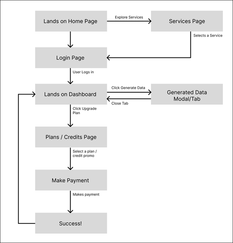
I translated research insights into wireframes that established the platform's structure and user flow before visual design began. Key wireframes and design decisions are shown below.
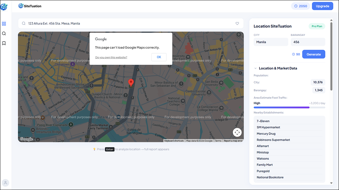
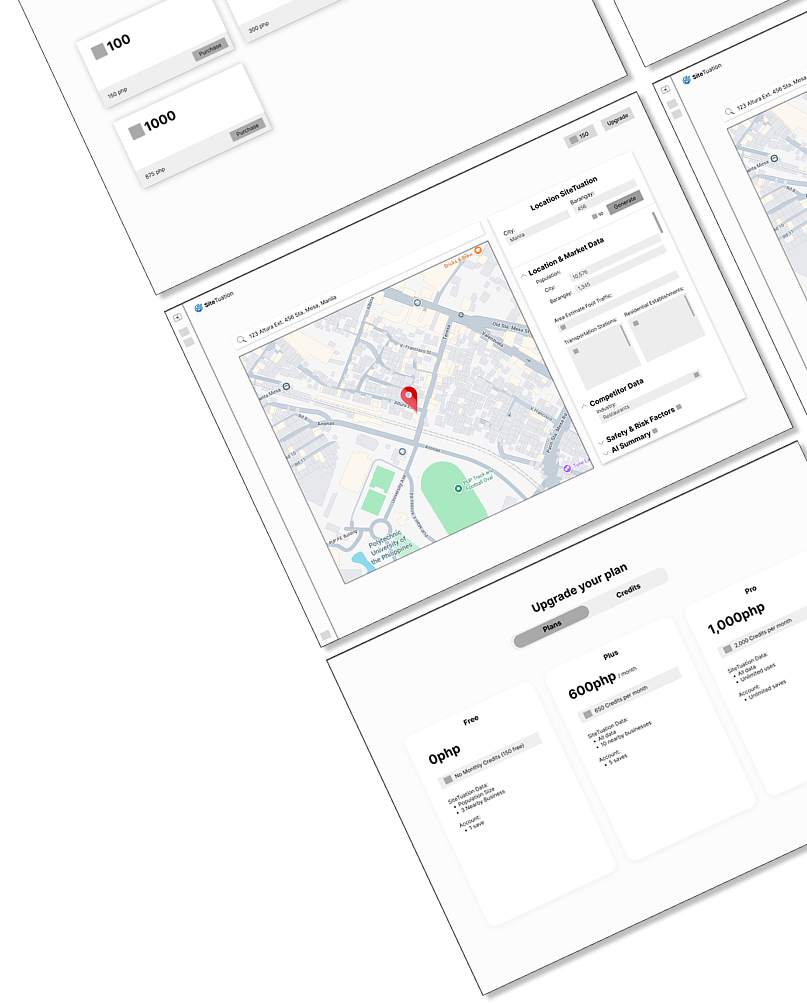
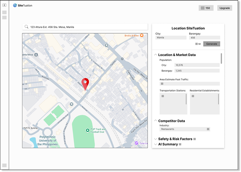
1. Main Dashboard
Design Decisions
-
Side-by-Side Layout for Location Analysis
The interface places the interactive map on the left and the generated location insights on the right, allowing users to maintain geographic context while reviewing analysis. -
Grouped Data Display
Information is organized into logical sections instead of displaying all available data at once, improving readability and reducing cognitive load.
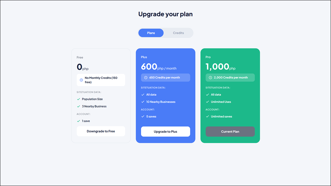
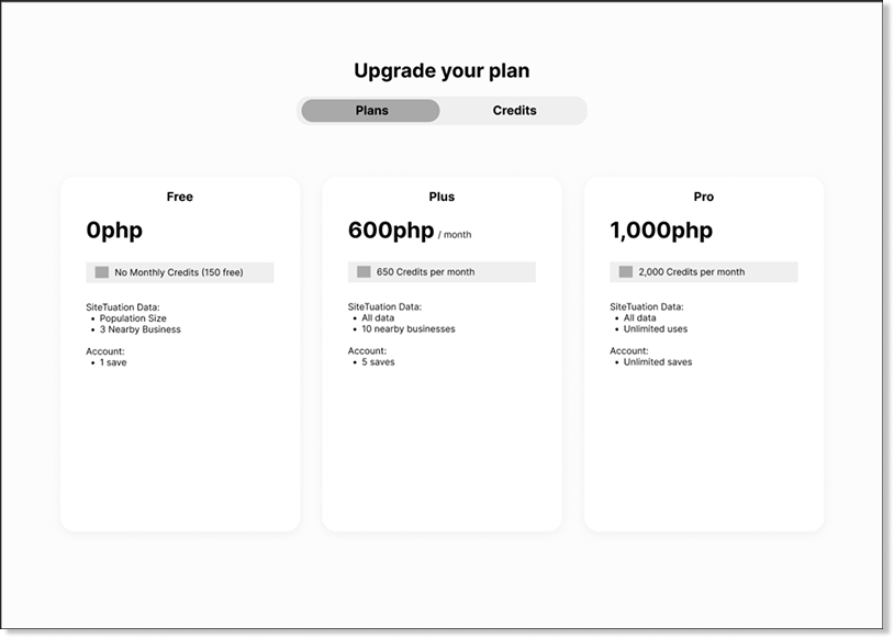
2. Plans Page
Design Decisions
-
Standard Three-Tier Pricing Structure
The Free, Plus, and Pro plans follow a familiar SaaS pricing model, making subscription options immediately recognizable. This structure was decided in collaboration with the development team.
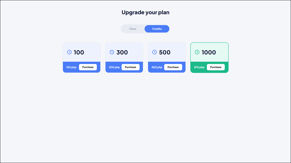
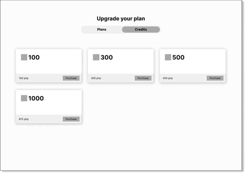
3. Credits Page
Design Decisions
-
Separate Credit Purchasing from Subscription Plans
Credits were presented independently from subscription plans so users could clearly distinguish recurring subscriptions from one-time credit purchases, reducing confusion during billing.
Outcome
A Strong Foundation for the Final Product
The wireframes established a clear foundation for the product's user experience and provided a structured blueprint for subsequent UI design and development phases.